I Built an Expense Tracker for Myself
For years, my expense tracker was a notes app.
Apple Notes first, then the notes app on my Moto G. The format never changed:
10 chai
30 davai
Amount, then a couple of words. That's it. I'd type it standing at the shop with the change still in my hand, because that is the only moment I reliably remember what I just spent. Ten seconds later I'm walking, thinking about something else, and the expense is gone.
At the end of the month I'd mail the list to myself, and paste it into ChatGPT when I wanted to know where the money had actually gone.
It worked. That's the part worth saying out loud — the system was good. What it lacked was everything around the list: I couldn't search it, couldn't see last month next to this one, couldn't ask it anything without copying it somewhere else first.
So I built Expense Notes. And the main decision, the one everything else hangs off, was to change as little as possible about the part that already worked.
It still records exactly what I type. It doesn't interpret it, doesn't tidy it, doesn't ask me to pick anything from a list. 10 chai goes in as 10 chai.
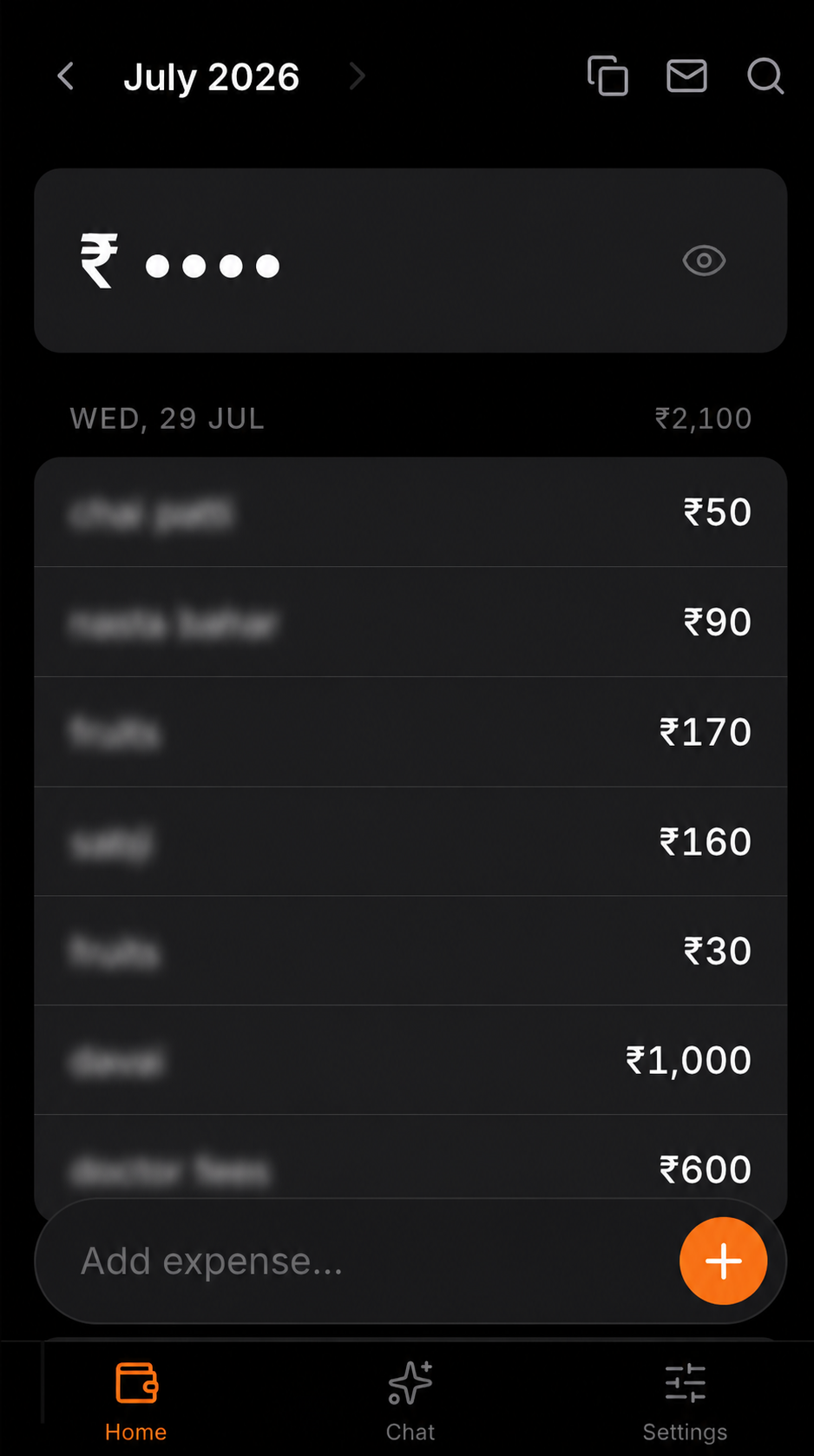
Everything it does
The whole app, in one list:
- Add an expense by typing one line — or paste a whole block and add them all at once
- Browse any month, with entries grouped by day and a subtotal per day
- Edit or delete any entry in place — amount, note or date
- Search every note ever written, across all months, with its own subtotal
- Copy the month as plain text, for pasting into ChatGPT
- Email the month to myself, from my own address
- Ask questions about the spending — the analysis step, built in
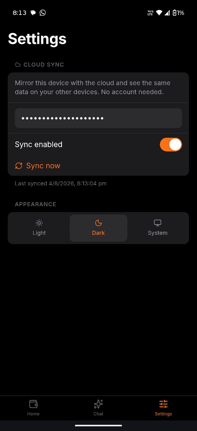
- Sync across devices with a shared passphrase and no account
- Light, dark, or follow the system
- Hide the headline total with a tap, so it isn't readable over a shoulder
- Works offline, and installs to the home screen like an app
Ten of those eleven are things a notes app couldn't do. The first one is the thing a notes app already did perfectly, and it's the one I was most careful not to break.
The line is the whole interface
There's one text box. You type a line, it becomes an expense. No amount field, no note field, no save button, no picker.
Which means the app has to work out what I meant from a line I typed without thinking about it. The entire rule is:
The first number in the line is the amount. Everything else is the note.
That's the whole parser:
const re = /(\d[\d,]*(?:\.\d+)?)\s*(k|K)?\b/;2,000, 2k and 1.5k all resolve to rupees. The rest of the line gets the amount snipped out of it, whitespace collapsed, and is stored exactly as I typed it.
I like this rule because there's nothing to remember. A labelled format — amount=2000 note=petrol — would be unambiguous and would also replace type what you mean with recall a syntax, which is the tax I was trying to remove. Sending the line to a model to be parsed would handle anything I threw at it, and would put a network round-trip between me and a record I'm making while someone waits behind me.
It has an honest cost. If I type 2 kg aata 120, it records ₹2. The rule can't tell a quantity from a price.
I've never actually hit it, because a rule this simple shapes how you type instead of fighting you — the amount just goes first, the way it always did in the notes app. A dumb rule you can learn in one sentence won't surprise you twice. A clever one surprises you forever, in small ways, until you stop trusting it.
Three details make it hold up in practice:
- A live preview floats above the box as you type, so you see how the line parsed before you commit it. The parser is pure and cheap precisely so it can run on every keystroke.
- Enter submits; Shift+Enter adds a newline. A whole block pasted from — yes — a notes app goes in as one action.
- Lines with no number are skipped and reported, not silently dropped:
Added 3 entries · ₹2,100 · 1 skipped (no amount). Quietly discarding a line I thought I'd recorded is the one failure I'd never catch later.
There's also a small bug I'm glad I hit early. The input clears synchronously, before the database write is awaited:
// Clear the input synchronously BEFORE the async DB write so fast input
// can't append to a stale buffer (optimistic clear).
setText("");
Clear it after the await instead, and fast typing lands in a stale buffer — your next entry gets concatenated onto the one you just submitted. Optimistic clearing isn't a nicety here. It's the difference between the app tolerating quick entry and corrupting it.
Where the notes live now
An expense is stored like this:
type Expense = {
  id: string;
  amount: number;      // whole rupees
  rawText: string;     // the original line, verbatim
  note: string;        // everything that wasn't the amount
  date: string;
  createdAt: string;
  updatedAt: string;
  deleted?: boolean;
};
Nothing derived. Nothing inferred. rawText keeps the line I actually typed, in case the parse was ever wrong.
It lives in IndexedDB, through Dexie, on the phone — as the source of truth, not as a cache of something on a server. Typing an expense has to work in a shop with two bars of signal, because that's where I am when I type them. A write that needs the network is a write that can fail in front of me while somebody waits.
The nice part is that the database is the state:
useLiveQuery(
  () => db.expenses.where("date").startsWith(monthKey)
          .and((e) => !e.deleted).reverse().sortBy("date"),
  [monthKey],
)
Any write re-renders every view subscribed to it. No refetching, no cache invalidation, no store, no state lifted up into React just so two components can agree.
That costs something real, and it's worth naming: every component in this app is a client component. There are no Server Components doing data work, and there can't be, because the server doesn't have the data. Going local-first means opting out of a large part of how React renders things now. Here, it's obviously the right trade. It isn't free.
What a notes app never gave me
This is the part I actually built the app for.
Months. A switcher at the top moves between them; entries group by day, each day carrying its own subtotal. In a notes app, last month was a different note I'd have to go find.
Search across everything. Not this month — everything. This is the one I use most: I can type dmart and see every D-Mart run I've ever recorded, across every month, with its own subtotal at the top. That question was simply unanswerable before, and it's the reason a list in a notes app stops being useful once it's long enough to matter.
Edit in place. Tap a row, fix the amount or the note or the date. I type these one-handed at a counter; some of them are wrong.
A total that starts hidden. The headline figure is redacted to ₹ •••• until I tap the eye:
const [showTotal, setShowTotal] = useState(false);It's the one number on the screen legible from a metre away — which is exactly where the person behind me in the queue is standing. Individual rows stay visible, because reading those means leaning in.
The detail I like is that it's component state, not a saved preference. If I persisted it, "hidden by default" would be true once, and after that it'd be whatever I last left it as. Keeping it in memory means it resets to hidden every single launch. The safe state is the one you get for free; the risky one costs a deliberate tap, every time.
The ChatGPT step, moved inside
The last thing the notes app couldn't do was answer a question. That's what the copy-paste-into-ChatGPT ritual was for, and it's now a tab.

Two decisions here matter more than which model I used.
The device sends its own ledger with every question. The server keeps no state and never reads the database. So the answer always reflects what this phone actually holds, whether sync is on or off, and it can never be stale. A couple of hundred entries is nothing against a million-token context window.
I didn't build embeddings or retrieval, and I want to be clear that this is not laziness. Retrieval solves a problem of scale I don't have. My entire financial history fits in one prompt with room to spare. A vector store would add chunking decisions, an index to keep in step with the ledger, and a genuinely nasty new failure mode where the model answers confidently from whatever subset it happened to pull back. Sending everything is simpler and strictly more accurate.
The grouping has to come from the note text, because that's all there is. My notes are Hinglish, so the vocabulary lives in the prompt:
Notes are terse and often Hinglish. Some vocabulary: saman = household goods, sabji/sabzi = vegetables, davai = medicine, nariyal pani = coconut water, kirana = grocery shop, nasta = breakfast/snack, jaach = medical test, pooja = prayer items, kachra wale = garbage collector, panchar = puncture.
Kavita, Jiya, Yug and Parents are people the user spends money on, not merchants. An entry can belong to two groupings at once — "davai for kavita" is both medicine and money spent on Kavita. Say so when it matters.
That last line is the one no database column can express. davai for kavita is honestly two things at once: medicine, and money spent on a particular person. Any structure that files it under one heading makes it disappear from the other total — and you'd never notice, because the entry is sitting right there in the list looking perfectly recorded.
A sentence in a prompt handles it without complaint. That's the trade the whole app is built on: keep the record dumb and exact, and put the judgement at the point where somebody's actually asking a question.
Except the arithmetic
Judgement, yes. Addition, no.
The monthly totals are computed in JavaScript and handed to the model as settled facts:
# MONTHLY TOTALS (authoritative — use these, do not re-add)
2026-07: <computed total> (219 entries)

# ALL ENTRIES (date,amount,note)
2026-07-29,50,chai patti
2026-07-29,90,nasta bahar
...
And then the prompt makes it binding:
The monthly totals given below are computed by the app and are correct. Use them. Do not re-add the raw entries to check them, and never contradict them.
When you break a month down into groups, the parts must add up to that month's total above. Check your arithmetic against it before answering, and if the parts do not reconcile, recount rather than presenting numbers that do not add up.
Grouping is the model's job. The total is its checksum.
Here's what goes wrong without that split. Ask a model to add two hundred numbers and you will get a number — well formatted, roughly the right size, quietly wrong. Then ask it to break the month into six groups and you'll get six numbers that don't add up to anything in particular. Nothing in the output tells you. There's no error, no warning, no visual difference between a correct breakdown and an invented one. You find out when you make a decision based on it.
On a record of money, silently wrong arithmetic is worse than no answer at all. So the app computes what it can compute exactly, and the model gets a figure it isn't allowed to argue with. Every grouping it invents has to reconcile against that figure — which turns "trust the model" into "check the model against something I already know."
Two devices, no accounts
I use this on my phone and occasionally on a laptop, so the records have to meet somewhere.
There are no accounts. Authentication solves a problem I don't have — accounts exist to tell users apart, and there is one user. A login screen would mean a users table, sessions, password reset and an email flow, all to answer a question with exactly one possible answer.
So access is one shared passphrase, checked in constant time against a server-only secret:
const a = Buffer.from(provided);
const b = Buffer.from(secret);
if (a.length !== b.length) return false;
return timingSafeEqual(a, b);
It's a lock on a door, not an identity system, and I'd rather ship an honest lock than a pretend identity system. Both API routes import that one function — a second, drifting copy of a security check is worse than the import.
The merge rule turned out to be a single SQL clause:
ON CONFLICT(id) DO UPDATE SET ...
WHERE excluded.updatedAt > expenses.updatedAt
Newest write wins, per record, decided by the database. There is no merge code on the server at all. When your conflict resolution fits in a WHERE clause, that's a good sign you picked the right store.
Two smaller things fell out of that, and both are the kind of bug you only find by having it happen to you:
Deletes are tombstones. Deleting sets deleted: true and bumps the timestamp; the row never actually leaves. If it were really removed, the other device couldn't tell "this was deleted" from "this hasn't arrived yet" — absence carries no timestamp, so it can't win a newest-wins comparison. A deletion has to be something you can transmit, which means it has to be a value.
Applying a sync must not look like a local edit. Normal mutations fire a change event that triggers a sync. Pulling remote records writes them with raw bulk operations that deliberately skip that event — otherwise applying a pull looks like a local change, which triggers a sync, which pulls, which applies. Two write paths that read almost identically in the source and must not behave the same way.
Sync itself is best-effort and silent. It runs on load, on reconnect, on tab focus, and a couple of seconds after a local change. If it fails, nothing is lost, because the write already succeeded on the device. It'll go again next time.
The email that didn't change
The month-end mail still goes out, in the same plain text it always did: the month name, one amount note line per expense, then the total.
Two buttons produce that text — the email, and a copy button that puts the month on the clipboard so I can still paste it into ChatGPT if I want to. Both call the same builder:
export function buildMonthText(monthKey: string, entries: MonthEntry[])If each one formatted independently, they'd drift. One would gain a total the other lacked, or order the entries differently, and I wouldn't find out for months, because I don't diff my own emails. One builder, two callers, no drift possible.
It sends over Gmail SMTP with an app password rather than through a hosted mail service, and the reason isn't cost. The mail has to come from my own address, so it lands in Sent beside years of these — a monthly record that suddenly arrives from a different sender is a different archive. That archive predates the app by a long way, and I'd rather the app join it than replace it.
How this actually got built
I wrote almost none of this by hand.
The code was built with Claude Code, Anthropic's CLI, running in the terminal against the repo. The design was done in Stitch, and — this is the part that changed the loop for me — Stitch's MCP server was wired into the coding session, so the design wasn't a picture on a second monitor. It was a source the model could read while writing the component.
That matters more than it sounds. The usual version of this loop loses information at a specific point: a design exists as an image, a human looks at the image, and retypes the numbers as code. Spacing gets close. Type sizes end up "about right." A radius is off by two pixels and nobody notices for a month. Every retyped number is a chance to be slightly wrong, and the drift only compounds.
With the design readable inside the session, "per the design" stopped being a judgement call and became a lookup. You can see it in my commit messages:
Match both input bars to the design source
Nest the add button inside the entry pill, per the design
Set the headline total to 34px, per the design
Those aren't corrections after the fact. That's a specification being applied, down to the type scale — and the details that normally get lost are exactly those small ones nobody would argue about, which are cumulatively the whole difference between an interface that looks considered and one that looks approximate.
I designed the screens by prompting, too. The whole visual language came out of that loop rather than out of a Figma file I pushed pixels around in.
The design system it landed on
It's Apple HIG-inspired, and the token file says so at the top. Two rules carry most of the look:
The page is the darker surface; cards sit lighter on top. Never a white page. Light mode uses iOS's system grouped background (#f2f2f7) with white cards; dark mode goes true black with #1c1c1e cards. A white page gives you nothing to layer against — every card has to be outlined to be visible, and outlines pile up into noise. Make the page the darker plane and elevation reads as tone, so a card needs no border at all.
In dark mode, elevation is a lighter surface rather than a shadow. Shadows work by darkening what's behind them, and nothing is darker than black:
--card-shadow: none; /* lightness, not shadow, carries elevation here */If shadows are your only elevation cue, dark mode arrives flat. Lightness scales both ways; shadow only scales one.
The rest follows from those:
- Text lives on three strict tiers —
ink,muted,faint. Three is enough for every hierarchy the app needs, and holding the line at three is what stops it looking cheap. Cheap UI is usually not bad taste, it's flattened hierarchy: eight slightly different greys picked ad hoc, so nothing reads as clearly primary. - Grouped inset lists, captions outside the card, hairlines between rows inset to the text. A ledger is dense repeating rows, and one rounded container does the work of many borders.
- Orange, brighter on black.
#c2410cin light,#f97316in dark, because the darker shade goes muddy on black. A colour token isn't a colour — it's a colour in a context. - Tabular figures for money, so amounts align down the column.
- Inter stands in for SF Pro. One typeface everywhere, no separate mono face.
And the detail I care about most, which nobody will ever mention: the keyboard doesn't move the page. The viewport is configured so the soft keyboard shrinks the layout viewport rather than scrolling the document — the shell stays pinned and only the list moves under it. Get this wrong and the whole page heaves upward when you tap the input, the total you were looking at leaves the screen, and the app announces itself as a web page in a browser. Get it right and it just behaves.
What I'd take to the next thing
The thing I keep coming back to is how little of this app is about being clever with the data, and how much of it is about refusing to be.
The notes app was right. 10 chai is a complete record of an event: a number and what it was for, in the words I'd use. Everything I was tempted to add on the way in — a structure, a category, a tidy label — would have been me guessing, at the moment of writing, what I'd want to ask six months later. I don't know that yet. Nobody does.
So the app stores the line and gets out of the way, and every interpretation happens later, when there's an actual question on the table and something exact to check the answer against.
Store what was said. Decide what it meant later, when you know the question.
The record hasn't changed in years. It's still a number and a couple of words, typed at a counter with the change still in my hand, and it still ends up in my inbox at the end of the month.
All I really built was somewhere better for it to live in between.